The Challenge
We first met the Maryland Dental Action Coalition team when we worked with them on their logo at the MICA Grassroots Design Fest. Check out that case study here >
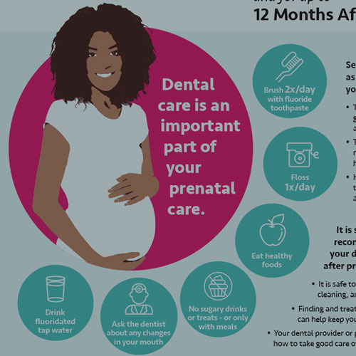
Once we completed the logo project, we decided to tackle another project—their Healthy Teeth, Healthy Kids brochures. These are three public-facing collateral pieces that encourage people to brush their teeth, see the dentist, drink water with fluoride in it, take care of their children’s teeth, and take care of their teeth during pregnancy.
Here’s what the existing brochures looked like:
I thought they were pretty cute and especially loved the little teeth characters!
Some of the specific things that MDAC wanted to address were:
- They were too easy to confuse
- It was hard to call them by a certain color (“the blue one”)
- They weren’t compelling enough in a rack of other brochures
All three of the brochures also had both English and Spanish versions.
Our challenge: Address these concerns, freshen up the design, and maximize the brochures’ effectiveness
The Process
Inspiration & Information Gathering
The first thing to do was gather information about the people they wanted to reach with these brochures and where the consumers might receive them.
Some things we learned from MDAC about these questions were:
- End consumers are primarily mothers of young children who are on Medicaid (i.e. low income, concentrated in urban or rural areas of the state).
- Distributed by local health departments, Medicaid providers —both dental and medical, WIC, Head Start, Judy Centers, and community health workers.
- The brochures are often racked and placed next to other health care information, handed out at health fairs or meetings focused on oral health, or given to parents by Medicaid providers.
Based on that, we were able to dive into more of the demographics of who’s receiving Medicaid in Maryland. Once we had that information, we were able to think about what other companies are marketing to this demographic and what their marketing efforts look like.
Some of the other things we wanted to take into consideration were:
- Making the most of the top front of the brochures, since that is what may be seen in a brochure rack
- Using photography on the front since studies have shown that our eyes are naturally drawn to other people’s faces. This would also give them another way to distinguish the brochures.
- Creating a bold color palette
- Adding icons to visually reinforce the messages in the text
- Making small tweaks to the teeth characters to make them even more impactful
- Not overcrowding the brochure since we know the Spanish translations are about 25% longer than English
Creating a Strategy
We decided to focus on just one brochure to come up with the overall look that we’d apply to all of them via our new color palette. The color palette had to have three distinctive colors that would be easily called by name and also had to integrate well with the teeth characters since we had introduced some “toothpaste colors” to them. Here’s how we updated the teeth:
We decided to use ultra-saturated jewel tones for the main brochure colors since those would grab attention and were also trending in marketing. Here’s the color palette we came up with. We made sure the coral/orange color didn’t read as red since that could be interpreted as negative.
We worked on the one master brochure to feature an image on the front and inside left, as well as using the “reveal panel”—the section that’s shown when you open the cover—to feature important information.
Once the master brochure was finalized, we proceeded to do image research for the additional images we needed for the Spanish and English versions of the brochures.
The New Look
Here’s how the brochures turned out!
Once the brochures were finalized, the clients worked with their developers to use the new look to update the Healthy Teeth, Healthy Kids website as well.
The Reaction
“The award-winning Healthy Teeth, Healthy Kids campaign, first launched in 2012, has been highly effective in increasing oral health awareness and oral disease prevention behaviors among parents of young children, but after seven years, it was time for a refresh. Chandra did an outstanding job of developing graphics that took the best elements of the existing campaign and created materials that are both visually appealing and stand out in a sea of health information. She also created iconography to reinforce key oral health messaging. Smiles all ‘round!”
—Diane Teigiser, Administrator, Maryland Dental Action Coalition